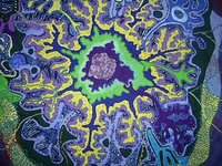
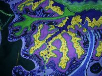
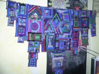
 NOTE: All of these are unfinished - we had to do the design in the workshop, but it was left to us to finish them off later.
We had to use hands in this design.

Rectangles, in three different colours, covered with a sheer, which was then cut away in places.
Rectangles again, in one colour only. Try to use the spaces as well. This wasn't very successful - the very orderly part of me did this one and it's very static. I have since added to this design - it's *almost* finished, and then I'll add the pic to the blog.
 Spirals. Why does this remind me of those ads in magazines for children's worm remedies? Ew. I have not got to completing this yet (but I'm working my way through all of these littlies, so I WILL get there.)
I struggled with this one and still don't like it. We had to do long wavy bits and then cut organic shapes around them. Maybe all of the colours are too strong and I need to emphasize one of them more. I just dont' know. I don't relate to this.

Circles. I enjoyed this one. Circles are such a satisfying shape! I definitely tend towards busy-ness in a design. There are many different textures here - and the brief was to keep to one colour and close tonal values, but to emphasize texture.


